![]()
![]()
![]()
Use LEFT and RIGHT arrow keys to navigate between flashcards;
Use UP and DOWN arrow keys to flip the card;
H to show hint;
A reads text to speech;
47 Cards in this Set
- Front
- Back
|
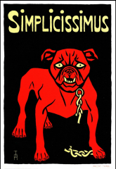
Artist: Thomas Heine Title: "Simplicissimus" poster Date: 1897 Style: simple poster style PLAKATSTIL *the word "simple" may have influenced the designer/ linked to caricature// modern anti-astablishment, going away from decorative style/// |
|
|
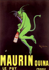
Artist: Leonetto Cappiello Title: Maurin Quina poster Date: 1906 Style: simple poster style PLAKATSTIL *known as the father of modern advertising/ used "infernal imagery" on several alcohol posters// made his posters "cartoony"/// going away from decorative style |
|

|
Artist: Lucian Bernhard Title: Priester Matches poster Date: c. 1905 Style: Sachplakat (object poster) Plakastil (poster style) *poster competition sponsored by Priester/ created the first sachplakat which spawned Plakastil// new style revolutionized ad world with bold color, minimal lettering, change from era's visually complex style of Art nouveau/// started on a table and then was simplified multiple times//// |
|
|
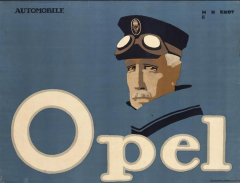
Artist: Hans Rudi Erdt
Title: Opel Automobiles poster Date: 1911 Style: Sachplakat (object poster) *didn't always have to rely on a more or less realistically depicted object, used O as steering wheel/ continued the plakastil style, minimal// attractive to the higher class - not product w/brand, more connection w/ user market/// |
|
|
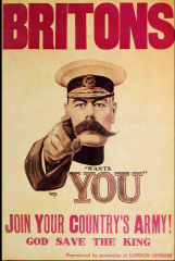
Artist: Alfred Leete
Title: Lord Kitchener Recruitment poster Date: 1914 Style: WWI Propaganda *drawn to more serious patriotic forms of print/ mustache spelled Kitchener's name with out saying it// british secretary of wars |
|
|
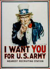
Artist: James Montgomery Flagg
Title: Uncle Sam Recruitment poster Date: 1917 Style: WWI Propaganda *adapted from a magazine cover/ modeled uncle sam after his own features// issued in the 1st & 2nd world war/// created 45 other posters for the government//// |
|
|
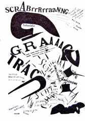
Artist: Fillippo Marinetti
Title: Poems from Les Mots en Liberte futuristes (futurist-words-in-freedom) Date: 1919 Style: Futurism *understand the influence of Stephane Mallarme on the development of Futurist graphic design/ expression of text for experience, breaks from traditional type arrangement, imagery made with text, dynamic not traditional, exaggerated fonts [different sizes & diff fonts, sets a tone] |
|
|
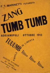
Artist: Fillippo Marinetti
Title: Zang tumb tuuum Adrianopoli ottobre (Adrianople October 1912: Words-in-Freedom) Milan Date: 1914 Style: Futurism *more tame, expressive, freedom/ the Futurists liberated words and letters from conventional presentation by destroying syntax, using verbs in the infinitive, eliminating adjectives and adverbs, abolishing punctuation, inserting musical and mathematical symbols, and employing onomatopoeia// read as literature, experienced as visual art, and performed as dramatic works. |
|
|
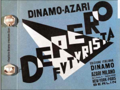
Artist: Fortunato Depero Title: Cover for Depero futurista Date: 1927 Style: Futurism *overlapping text, simple color palette, response to technology, different types of paper, experience w/ type functional chaos, arrangement w/text for communication |
|
|
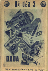
Artist: John Heartfield Title: Der Dada cover Date: 1920 Style: Dada PHOTOMONTAGE *ideally suited to the task of promoting the dadaist movement/ medium was the message// pasted composite image, newspaper pieces w/ photos then photographed |
|
|
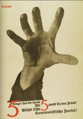
Artist: John Heartfield Title: Die Rote Fahne poster Date: 1928 Style: Dada *the whole arm being pushed upwards out of the page is a way to grab the viewer bc its realistic/ most memorable poster// represents 5 candidates of the party (hand is grabbing the nazi's |
|
|
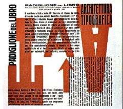
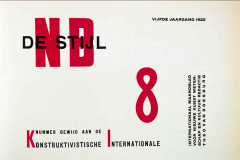
Artist: Theo van Doesburg Title: De Stijl cover Date: 1922 Style: De Stijl *asymmetrical rectangle (outlined) |
|
|
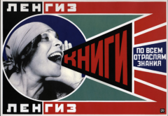
Artist: Alexander Rodchenko Title: "Books" poster Date: Style: Russian Constructivism *photography & graphic design, block san serif, clear no indication of artists hand, geometric, photomontage w graphic elements |
|
|
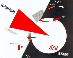
Artist: El Lissitzky Title: Beat the White with the Red Wedge Date: Style: Russian Constructivism *political - aims exclusivley russian movement/ hard edged lines that shapes of primary colors, appeared in painting and posters// uses basic shapes as propaganda poster |
|
|
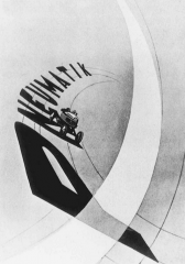
Artist: Laszlo Moholy-Nagy Title: Typophoto poster for tires Date: 1923 Style: Bauhaus TYPOPHOTO: an objective integration of word and image to communicate a message with immediacy |
|
|
Artist: Herbert Bayer Title: Exhibition poster Date: 1926 Style: Bauhaus *know that Bayer designed the universal alphabet type font/ quickly absorbed the principals of De Stijl & constructivism// led him to develop bauhaus style into its current state/// |
|
|
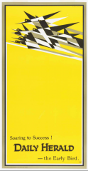
Artist: Edward McKnight Kauffer Title: "Soaring to Success" poster Date: 1919 Style: Art Deco *commercial context/ tension between flock and two opposing guidelines// dynamic sense and movement does not lead up to a point/// |
|
|
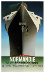
Artist: A.M Cassandre Title: Normandie poster Date: 1935 Style: Art Deco *considered his masterpiece/ breaking into geometry shapes// steamliner dominates the scene/// sets tone for luxury of Normandie//// look up (perspective)///// power draws us to it, advertisement |
|
|
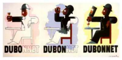
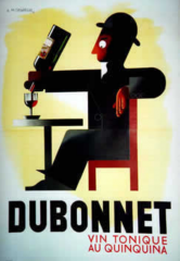
Artist: A.M Cassandre Title: poster for Dubonnet Date: 1932 Style: Art Deco DUBO(doubt)-the man eyes his glass uncertainly DU BON(of some good)-the beverage is tasted; DUBONNET-the product is identified as the glass is refilled *meant to be shown as a series/ product name is being repeated |
|
|
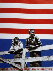
Artist: Lester Beall Title: Rural Electrification Administration Series2 Date: 1939 Style: Modern Graphic Design in America *used bands to associate background plane to foreground/ first time graphic design was hung in the MOMA// electricity in rural areas - electriticty is good for the USA |
|
|
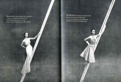
Artist: Alexey Brodovitch Title: Pages from Harper's Bazaar Date: Style: Modern Graphic Design in America *diagonal division appears/ makes a surrealistic contrast between the coiffed & elegantly dressed model & props(ladders)// modernist devices grabbed readers attention which Brodovitch directed to clothes/// modern styles are taking from Europe |
|
|
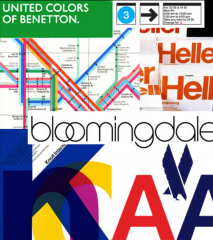
Artist: Massimo Vignelli Title: Corporate Identities Date: Style: Modern Graphic Design in America *know NYC subway map and Bloomingdale's/ long live modernism// solution to a problem is the problem itself/// if you can design one thing you can design anything//// subway- framed in black, focused on subtle movements of above ground activity, takes complex system and simplifies it (color codes)/ swiss design at its best |
|
|
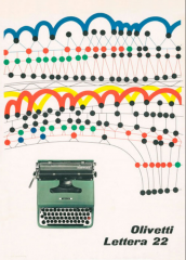
Artist: Giovanni Pintori Title: Olivetti Lettera 22 Date: Style: Modern Graphic Design *element of playfulness was fundamental to success of commercial modernist design/ helped humanize new range of unfamiliar products// convinced the public it was for everyone, not just mechanically minded///conveying the idea of what its like to type |
|
|
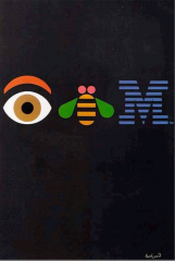
Artist: Paul Rand Title: Eye Bee M poster (rebus) Date: 1981 Style: Modern Graphic Design in America *passion for corporate identities/ introduced new ways of feeling & thinking// took risks and made mistakes/// stayed relevant for 60+ yrs/// americas best known graphic designer//// rand forced IBM to cohere into a single logo graphic entity |
|
|
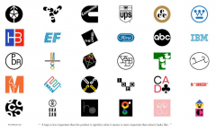
Artist: Paul Rand Title: Logos Date: Style: Modern Graphic Design in America *simplicity is a modern idea/ his worked helped make the world of business take the profession of design more seriously// rand was given full license to express his artistically inspired brand of Modernist design within commercial context |
|
|
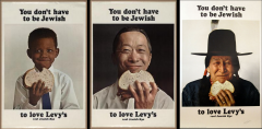
Artist: Robert Gage (DDB, Inc.) Title: "You don't have to be Jewish to Love Levy's" campaign Date: 1950's Style: Modern Graphic Design in America *photography became a dominant medium/ campaign does nothing, not based on facts or logic, just humor and emotion// one of the most successful campaigns/// |
|
|
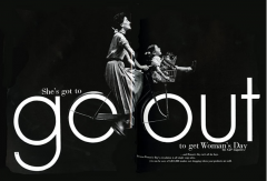
Artist: Gene Federico Title: Woman's Day magazine advertisement Date: 1954 Style: Modern Graphic Design in America *similar idea to Opel - integrating the O's as wheels/ witty word play demanded close relations w/ art director & copywriter// modernism is here! |
|
|
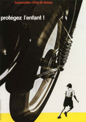
Artist: Josep Muller-Brockmann Title: Auto Club of Switzerland poster "Protegez l'enfant!" (Protect the Child) Date: 1955 Style: Swiss Design *asymmetrical organization/ mathematically constructed and objective photography// san serif type/// flush left ragged right= swiss design |
|
|
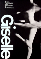
Artist: Armin Hofmann Title: poster for Basel Theater production of Giselle Date: 1959 Style: Swiss Design, Basel School of Design *Hofmann and Ruder were instructors that taught sensitivity to white space/ soft image compared to crispness of the text/black bkgd// image and type used in harmony/// |
|
|
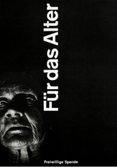
Artist: Carlo L.Vivarelli Title: Fur das Alter (Help the Aged) Date: 1949 Style: Swiss Design Zurich *increasing emphasis on clarity and functionalism within swiss graphic design/ everything in design was dedicated to importing posters message// placement of head within a daring but fitting symmetry created drama/// |
|
|
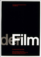
Artist: Josef Muller-Brockmann Title: Der Film poster Zurich Museums of Arts and Crafts exhibition poster Date: 1960 Style: Swiss Design *universal type approach/ how mathematics & geometry can be a basis for design// 3/5 ratio (most beautiful rectangle arrangement/perfect ratio)/// negative space//// won a competition for charity///// GOLDEN MEAN - pinnacle of swiss design |
|
|
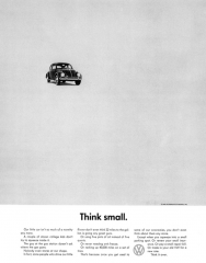
Artist: Helmut Krone (art director) & Larry Levinson (writer) Agency: Doyle Dane Bernbach Inc. Title: Volkswagen "Think Small" ad Date: 1959 Style: Modern Design *"first" use of the grid system, much speedier/ 3 columns, white space, san serif type// copy isn't a (buy me, buy me) copy is setting a scene |
|
|
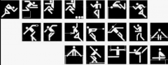
Artist: Otl Aicher Title: Pictograms for the Munich Olympics Date: 1972 Style: Design Systems *symbols for generally intelligent & multilingual/ perfected these pictograms-set the standard// grid vertical and horizontal/// removes visual noise//// all had the same angles |
|
|
Sachplakat |
object poster |
|
|
Plakastil |
poster style - [school in berlin for poster design] - characterized by clear, crisp, saturated, minimal color, design approach, antithesis of decorative style, abstract |
|
|
Typophoto |
an objective integration of a word and image to communicate a message w/ immediacy |
|
|
CUBISM |
most important art movement in the 20th century analytical cubism - subject matter is analyzed then combined in a new way. experience w/ subject matter. not the still life - sense of movement, geometry, minimal color/ focus on form [picasso, vincent vangoh] synthetic cubism - representative, pasted paper/collage is very influential w/design cubism is short lived but most influential/ analytical and synthetic cubism |
|
|
FUTURISM |
Marinetti was the founder of futurism/ marinetti argues for the distruction of the past so we can start over. he for the WWI so we could start over// futurism calls the youth to rebel from the past and they glorified speep and new technology, war |
|
|
DADA |
ZURICH DADA - dada is a lifestyle - started with cubism in literature (not visual)/ started in zurich switzerland// dadaist were artists/writers who wanted freedom from tradition, they wanted to shock the viewers/// rebelled in modern society (thought it was corrupt//// religion and moral codes were ignored |
|
|
DADA |
BERLIN DADA - John Heartfield - changes the name to this to protest/ used graphic art to protest against politics/ corrupted society - used photomontage |
|
|
RUSSIAN CONSTRUCTIVISM |
art should have a purpose/ It borrowed ideas from Cubism, Suprematism and Futurism, but at its heart was an entirely new approach to making objects, one which sought to abolish the traditional artistic concern with composition, and replace it with 'construction.' Constructivism called for a careful technical analysis of modern materials, and it was hoped that this investigation would eventually yield ideas that could be put to use in mass production, serving the ends of a modern, Communist society/// Constructivists proposed to replace art's traditional concern with composition with a focus on construction. Objects were to be created not in order to express beauty, or the artist's outlook, or to represent the world, but to carry out a fundamental analysis of the materials and forms of art, one which might lead to the design of functional objects.///Constructivists were to be constructors of a new society - cultural workers on par with scientists in their search for solutions to modern problems. |
|
|
ART DECO |
cubist, futurism constructivism art inspired/ term used for a style grown out of art neouvau/ industry/// The art deco style, which above all reflected modern technology, was characterized by smooth lines, geometric shapes, streamlined forms and bright, sometimes garish colours. Initially a luxury style (a reaction against the austerity imposed by World War I) employing costly materials like silver, crystal, ivory, jade and lacquer, after the Depression it also used cheaper and mass-produced materials like chrome, plastics, and other industrial items catering to the growing middle class taste for a design style that was elegant, glamorous and functional. |
|
|
MODERNISM |
rebellion against tradition, many people rejected from Salon/patronage of wealthy, forward-looking/ immigration from europe/ redefines the position of art direction at major magazines/ search for truth & integrity and richness of the mind/spreads in the US by the Works Progress Administration (WPA) during the great depression/ 1935 FDR instituted the new deal and the WPA was created/ allows people understand and comprehend easily/ bauhaus is part of modernism |
|
|
Works Progress Administration (WPA) |
WPA employed the most people (artists) to beautify and design/ gov. paid artists// over 2015 pieces of art were made |
|
|
SWISS DESIGN |
design is an important and socially useful activity/ designers job to spread info between components of society/ personal expression & eccentric solutions rejected for universal & scientific approach/ emerged in Switzerland/ influenced by Bauhaus & Destijl/ flush left and ragged right margin/ clear and factual copy/ objective photography/ mathematical grid/ san serif/ asymmetrical/ GOLDEN MEAN/RATIO |
|
|
MASSIMO VIGNELLI |
founded Unimark/ Unigrid systems/ used helvetica always/ was an Italian designer who worked in a number of areas ranging from package design through houseware design and furniture design to public signage and showroom design// Vignelli worked firmly within the Modernist tradition, and focused on simplicity through the use of basic geometric forms in all his work// "If you can design one thing, you can design anything"/ believed that grid can be used in every design |
|
|
DE STIJL |
dutch for "The Style" also known as neoplasticism/ founded in 1917 in Amsterdam/ Proponents of De Stijl advocated pure abstraction and universality by a reduction to the essentials of form and color; they simplified visual compositions to vertical and horizontal, using only black, white and primary colors/// De Stijl is also the name of a journal that was published by the Dutch painter, designer, writer, and critic Theo van Doesburg |